

Different factors of a logo such as the colour, shape, font and slogan have a massive influence on how a customer or client perceives your brand.
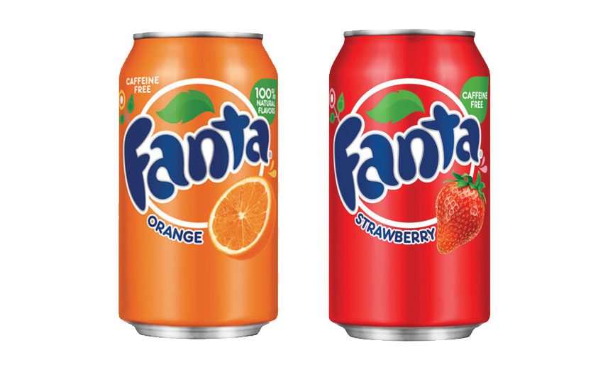
If you take into consideration the colour of the logo, different colours give a different message. If you look below at the Fanta drinks can, it uses the colour orange to tell the customer it’s a drink with orange as the main ingredient.
If you look to the right, you can see that the can is essentially the same but the colours have changed to red. Using red leads the customer to the perception that the contents could be cherry or strawberry.
Using the correct colour is just as important as choosing the company name or slogan, as each can set the tone or feel of the company. What you also need to consider is that some colours can be interpreted differently in other cultures. For example, in China, red means money whereas in America green is considered the colour of money.

Here at Square One Creative we understand the importance of the correct use of colour. We have shown (below) in work for the NHS how the use of their corporate blue and it’s variations are used throughout a report. We work with several companies who have an in house graphic designer and the relationship works really well as we are their in house, out house studio.

The colour blue gives the feeling of calm and wellness, whereas, colours like black or grey for example, could give a totally different feeling. These colours could give the perception of death or emptiness which would not suit an organisation whose aim is to promote health and wellbeing.
If you would like a chat about how we can use colour to build your brand awareness or indeed build a new brand that can match your business goals, please get in touch.